Case Study · 01
Homestead Coffee Company
Building a specialty coffee brand from the ground up — identity, spaces, and a website that works as hard as the team behind the counter.
Case Study · 01
Building a specialty coffee brand from the ground up — identity, spaces, and a website that works as hard as the team behind the counter.
Locations opened
Organic followers
Wholesale accounts
Content pieces directed
Overview
The Problem
Most new coffee brands either copy the clean-white minimalism of third-wave chains, or lean so hard into "local" that they never scale. Homestead needed a third path — a brand with genuine warmth and a specific point of view that could hold up across three locations, a roastery, and a wholesale program without losing what made it feel worth caring about.
We started with a vision, a name, and a single café in Istanbul. The challenge was building a brand that felt intentional from the very beginning — one that could scale across locations and markets without losing its character.
That meant making decisions about everything in parallel: what the space should feel like when someone walks in, what the identity communicates before they order, and what the website does when it's the first impression someone gets at 7am on their phone.
Key Decisions
Role
Creative Director · Designer
Timeline
2022 – Present
Website
homestead.coffee
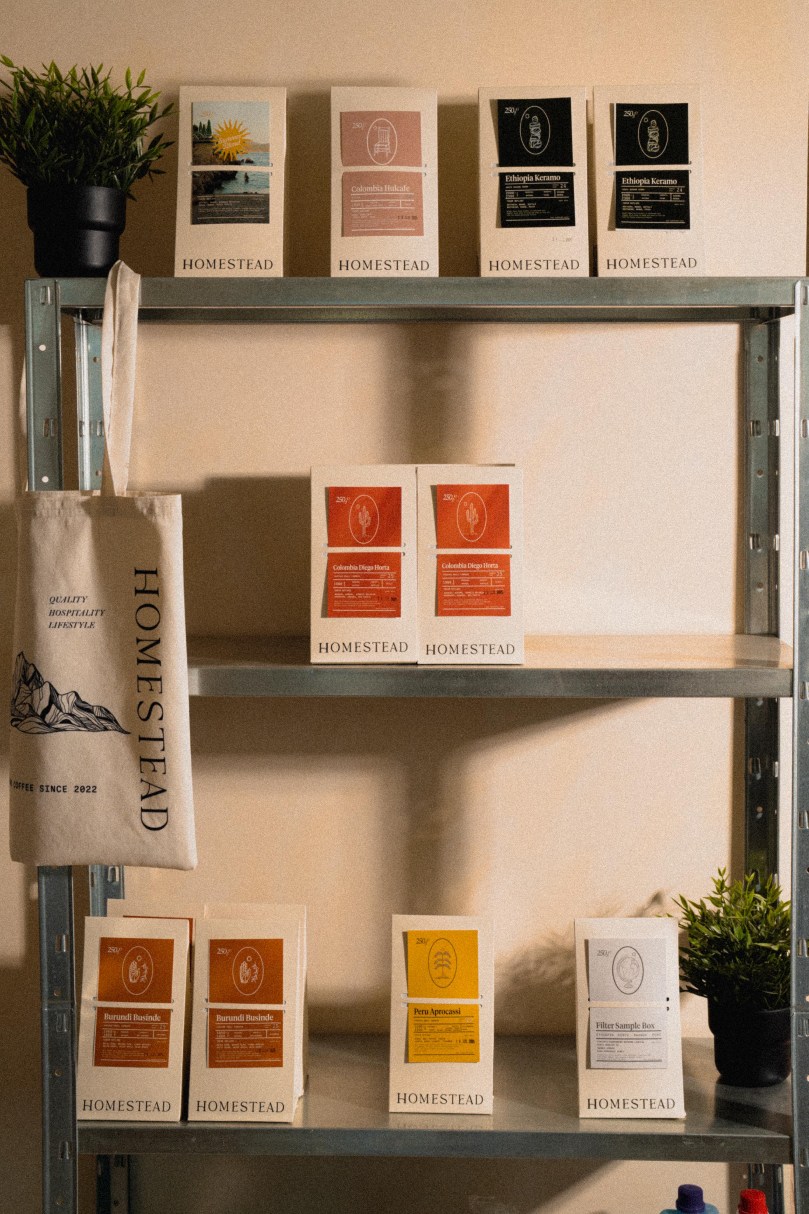
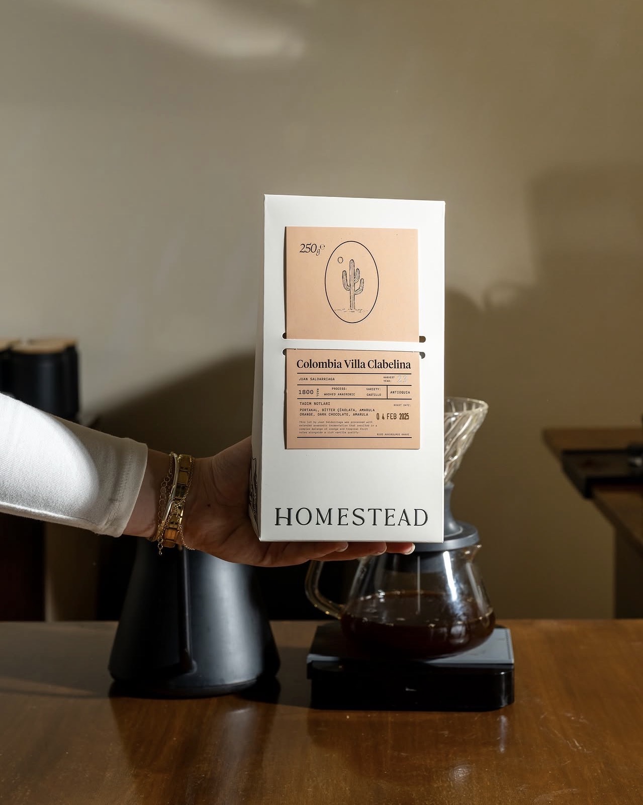
01 · Brand Identity
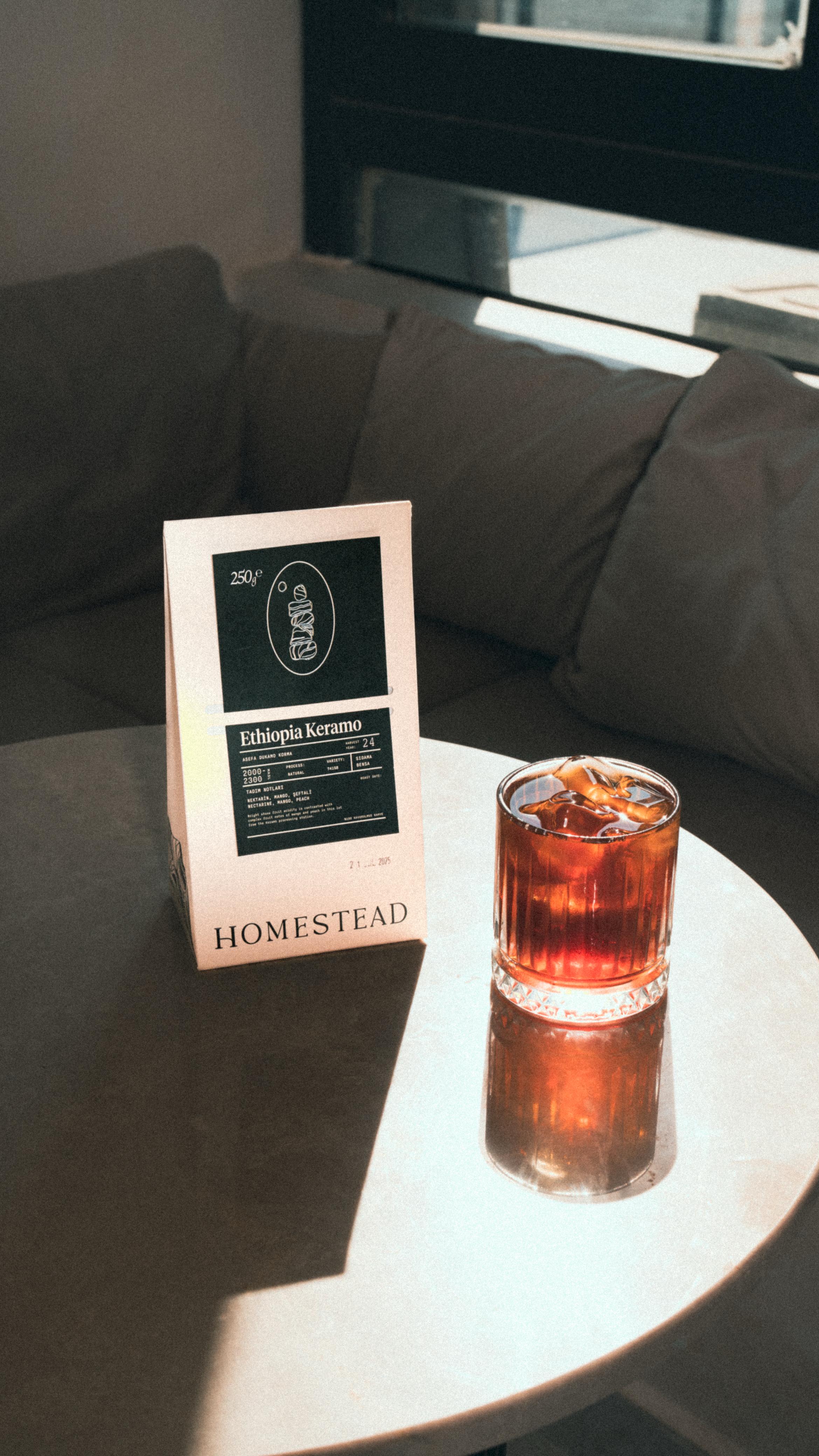
Before the first cup was pulled, we had a mark. The Homestead identity started with a hand-drawn quality — something warm, considered, and unhurried — and then we systematized it so it could live everywhere with the same intention.
The color palette draws from raw materials: terracotta, cream, deep espresso brown. Typography is set in a geometric sans that reads clean at small sizes and with character at large ones. Every decision in the system traces back to the same feeling: a place worth returning to.
Typography
Color Palette
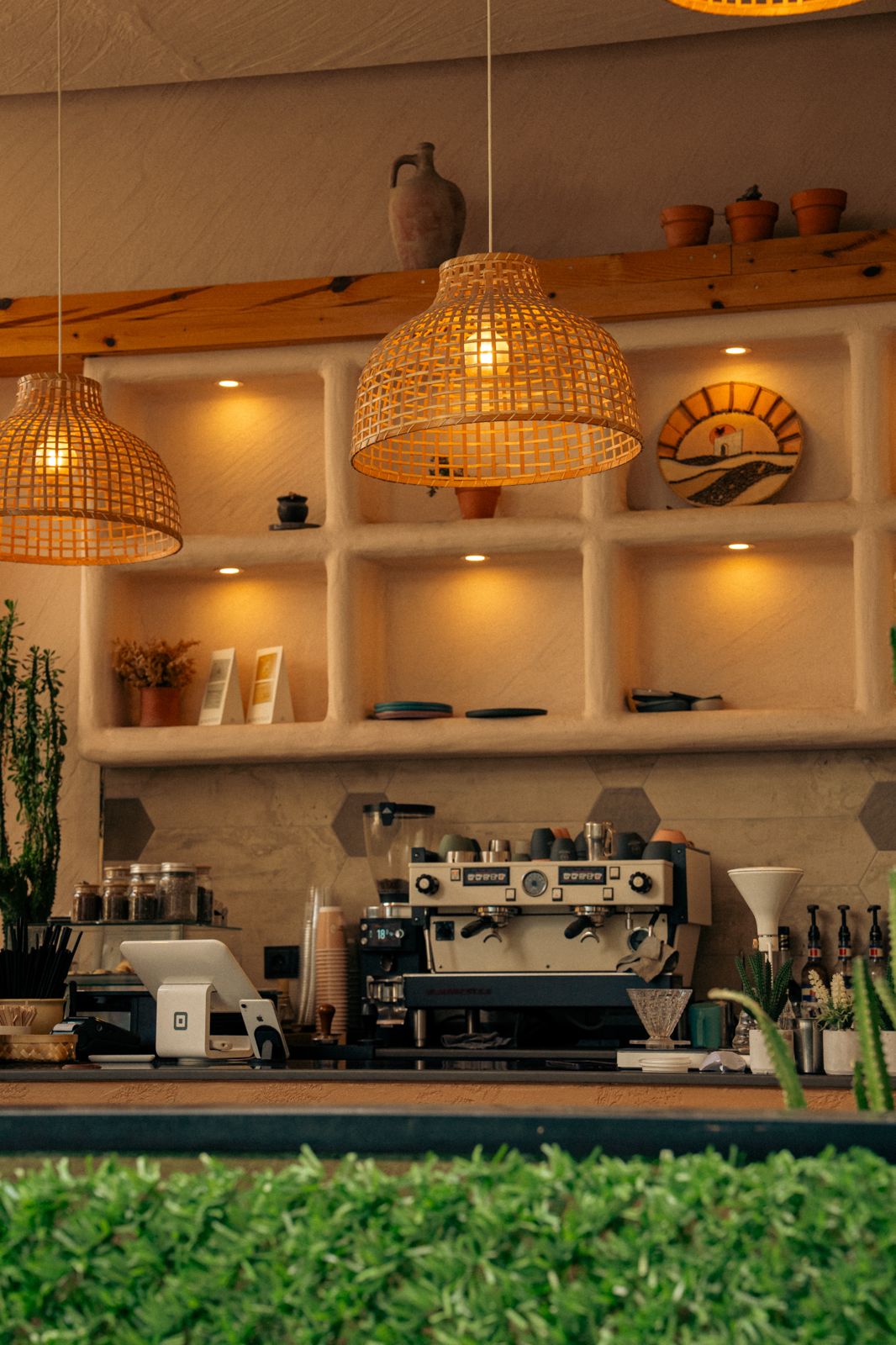
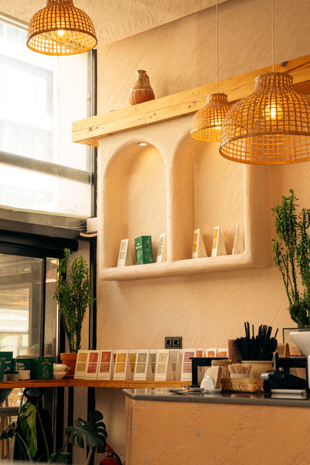
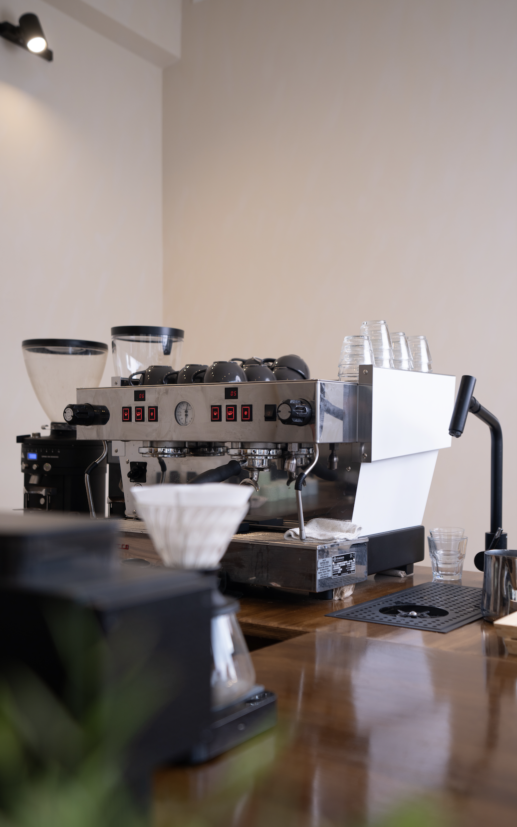
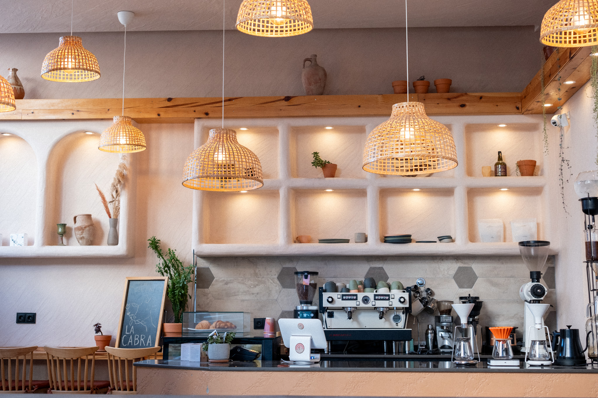
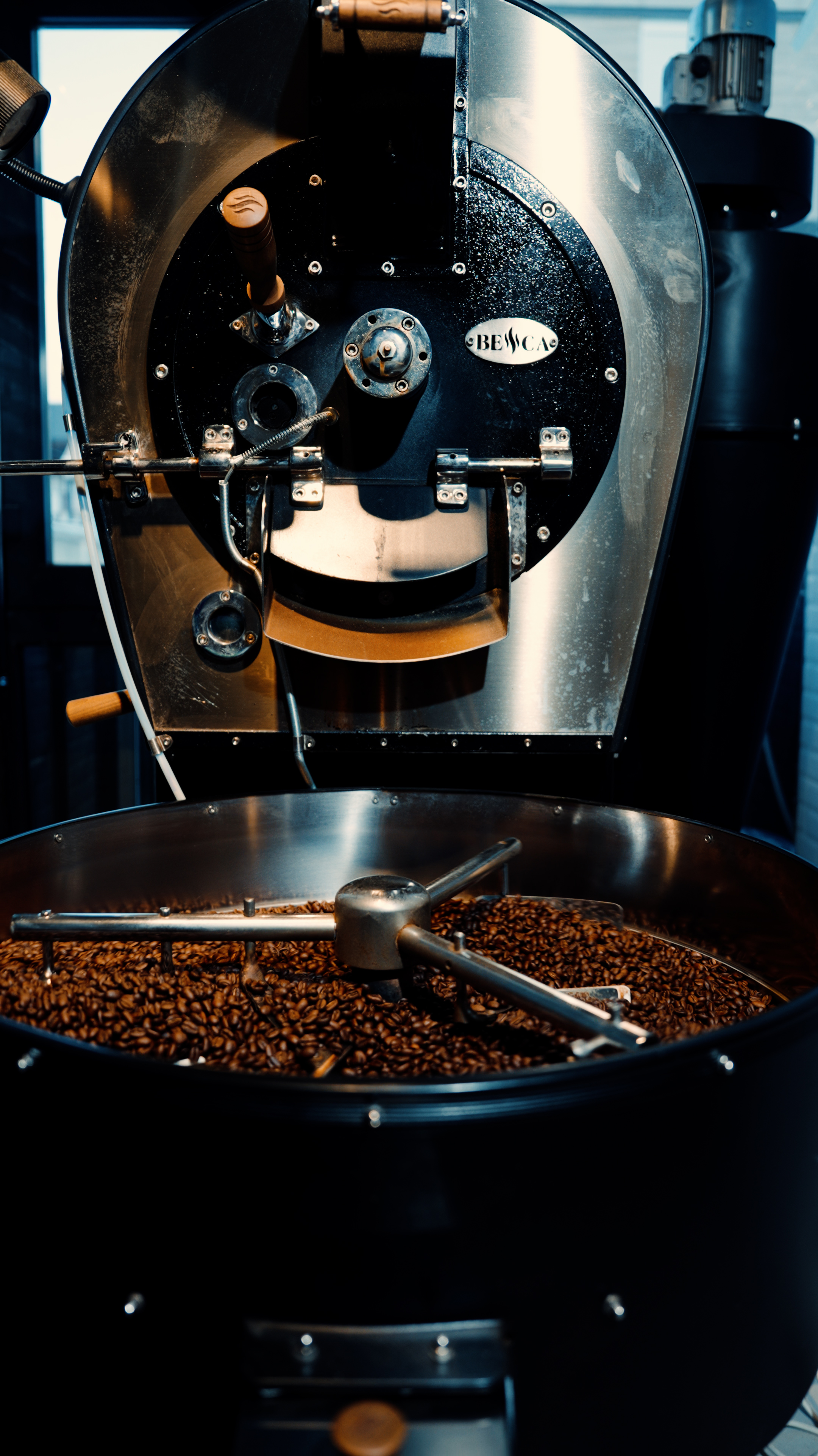
02 · Space Design
For our second location — a flagship café and roastery — I co-led the interior design process from concept to opening day. We wanted the space to feel like a natural extension of the brand: warm, tactile, and a little unexpected.
Raw concrete met warm wood. The roastery sat open behind a glass wall, letting the process become part of the atmosphere. Seating was designed to invite you to stay — not to move you through.
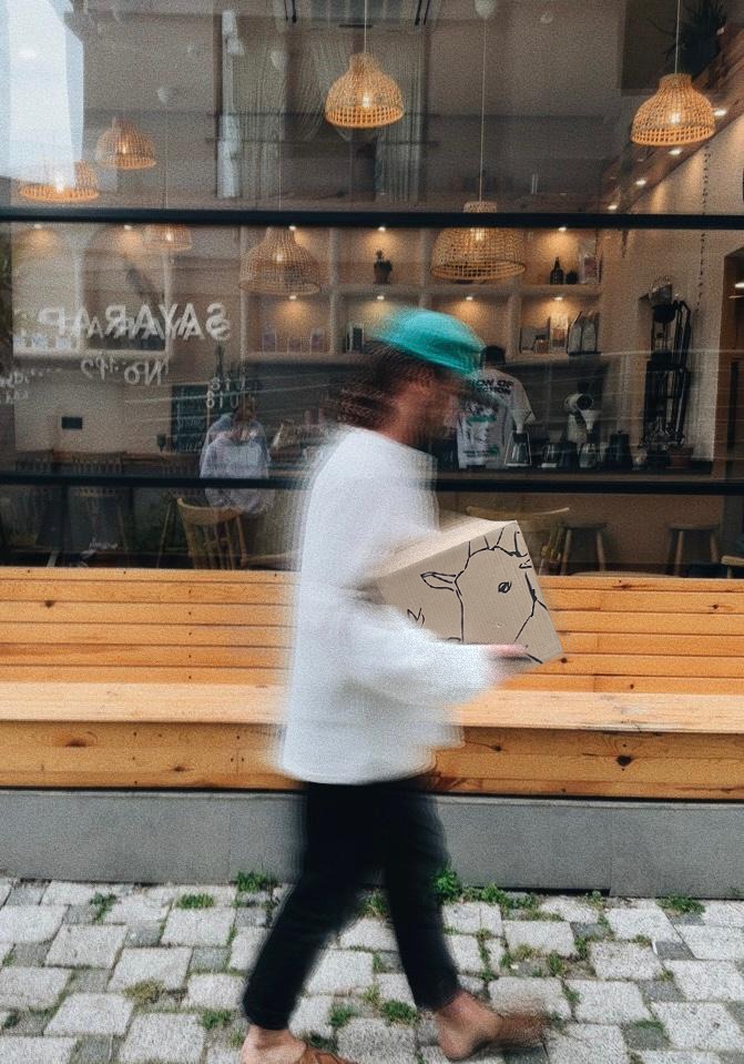
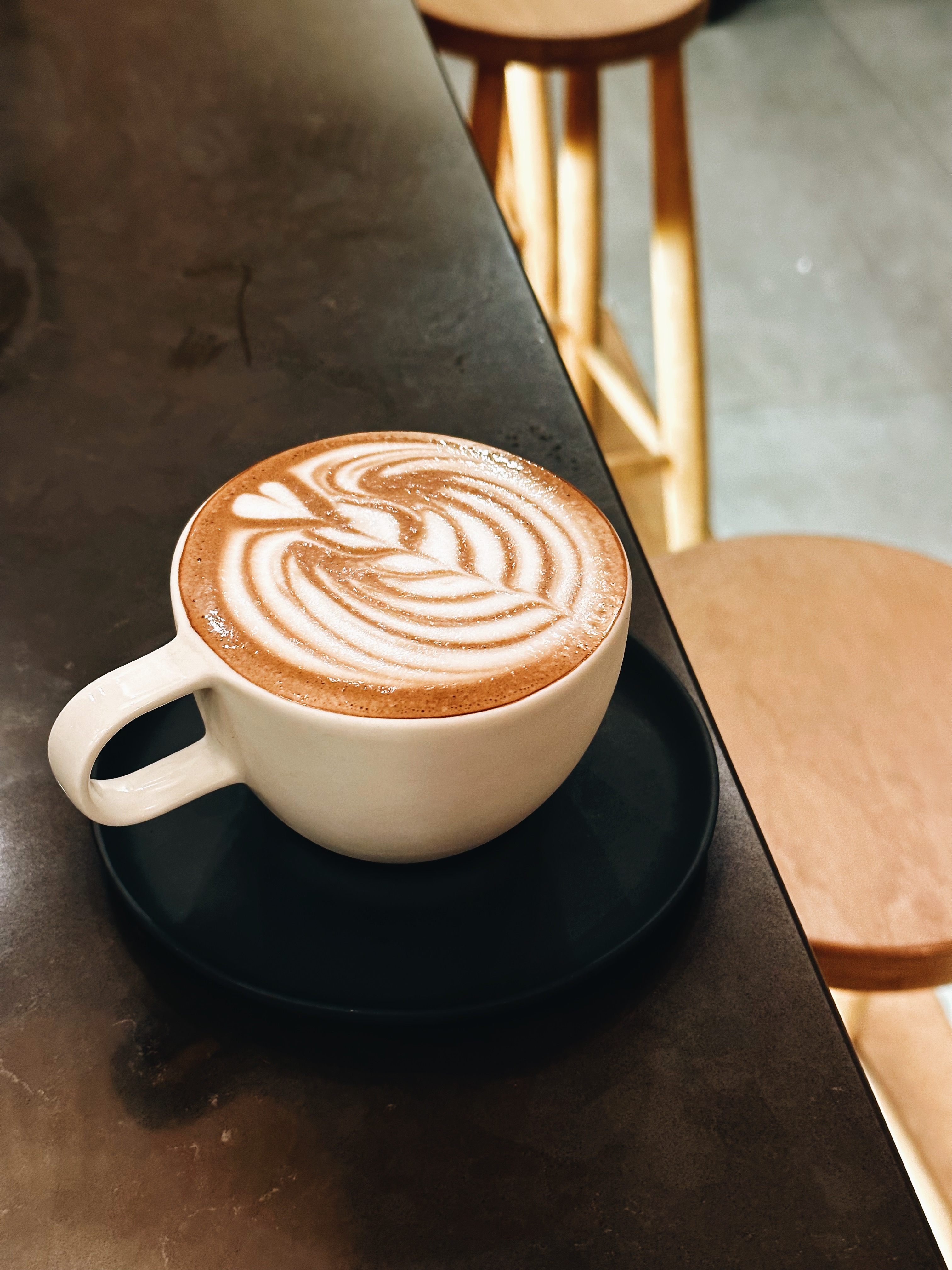
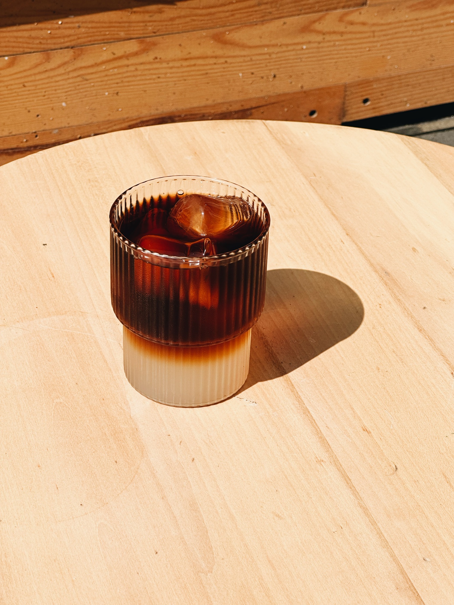
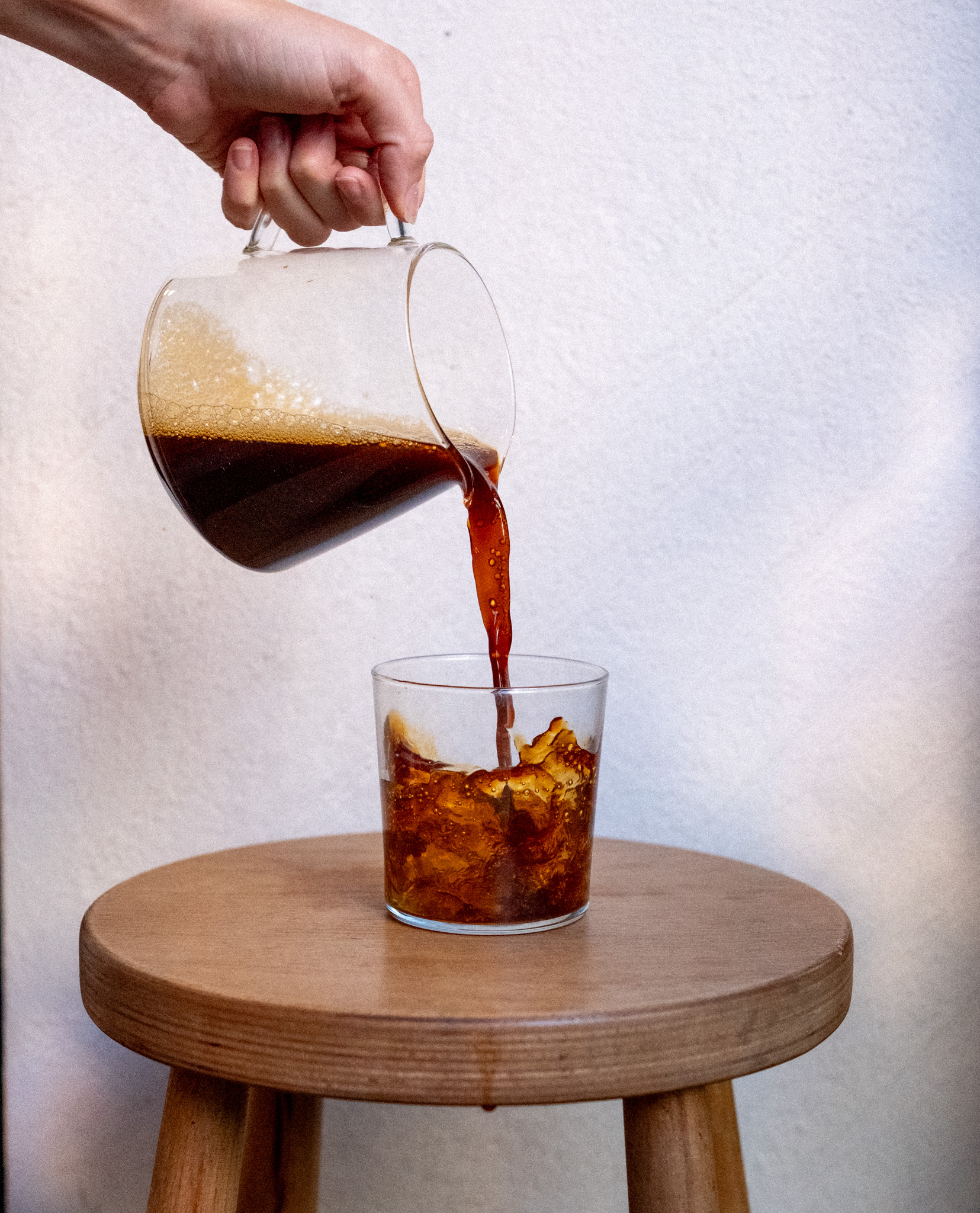
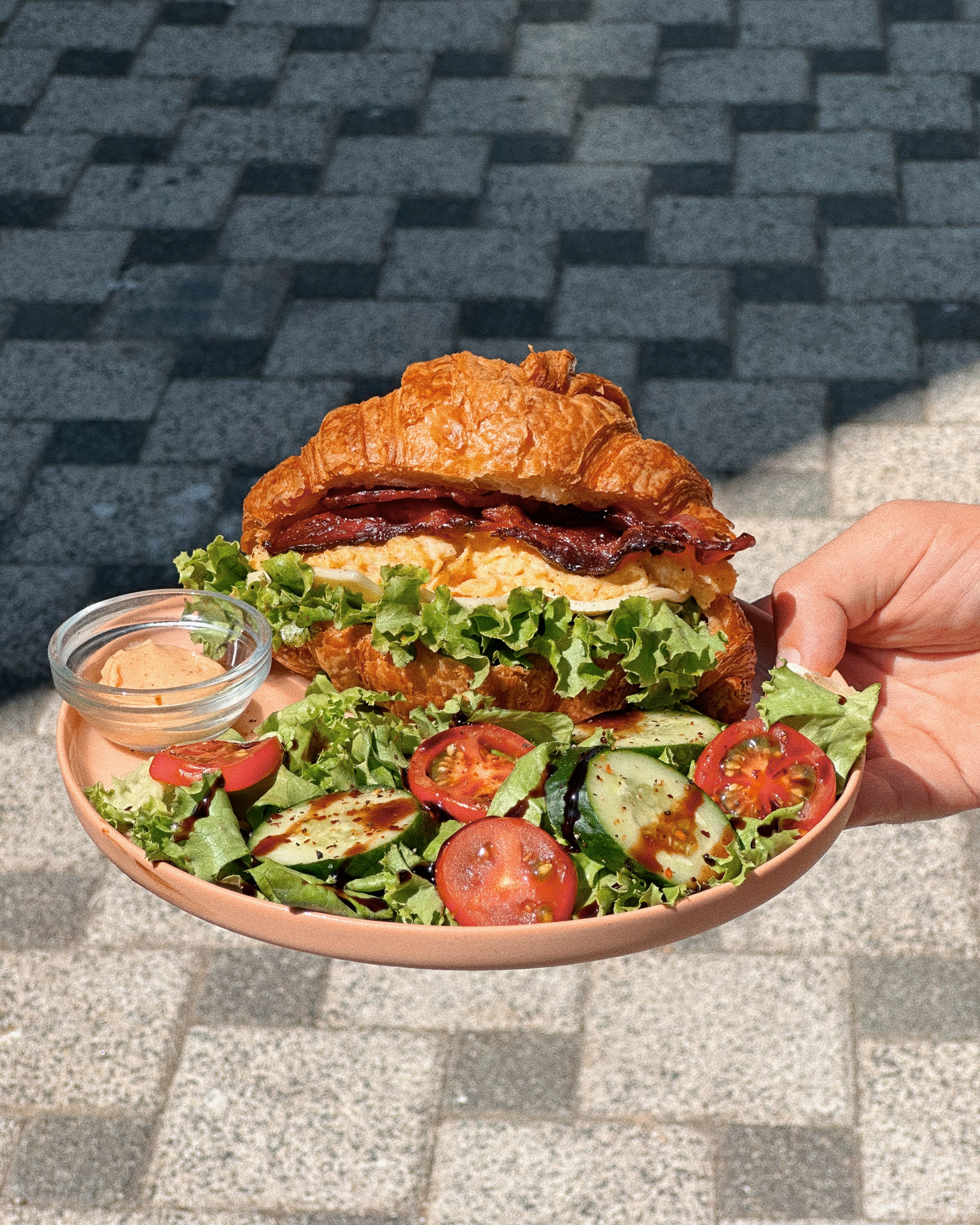
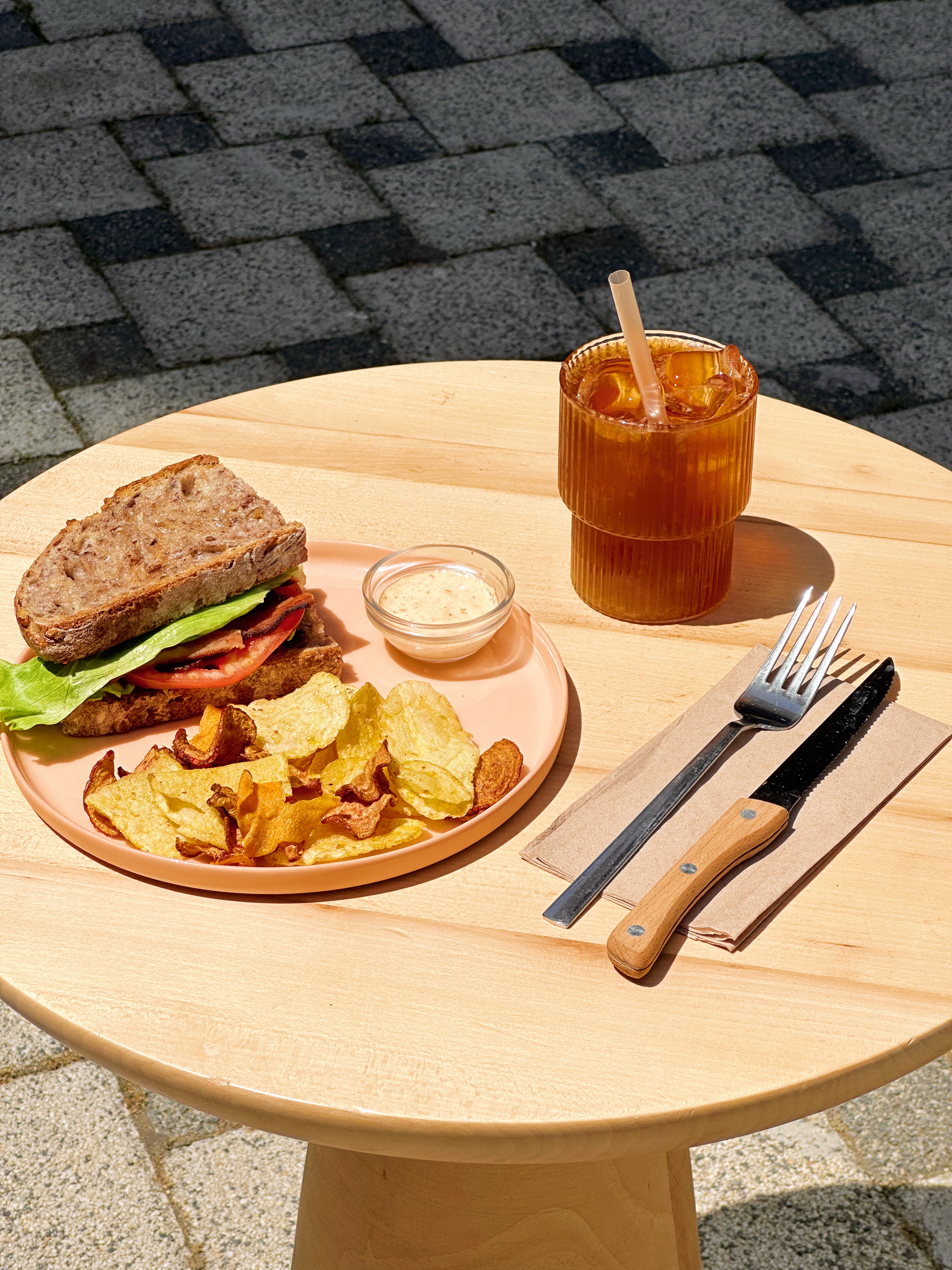
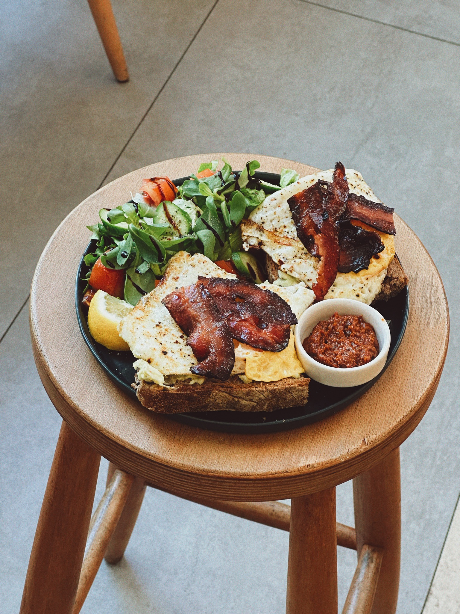
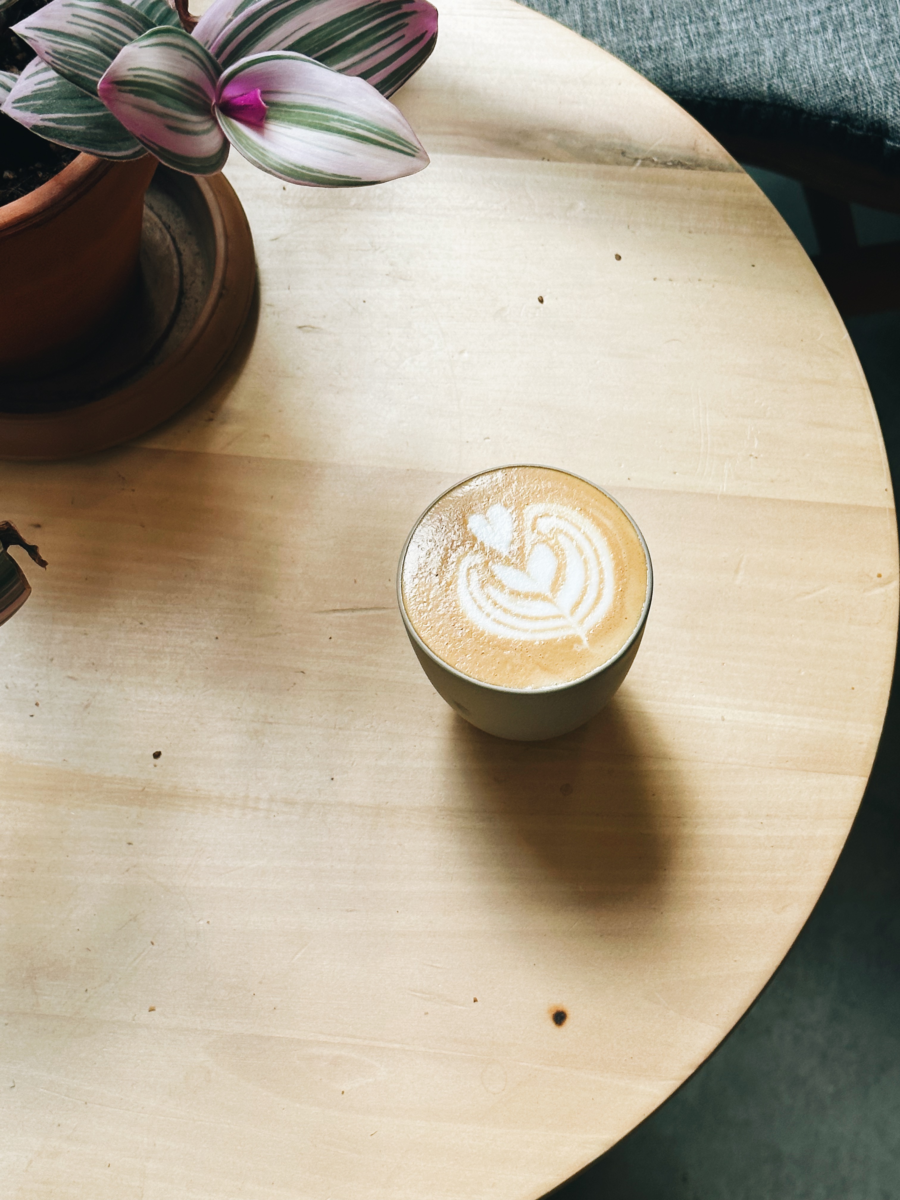
03 · Photo & Content Direction
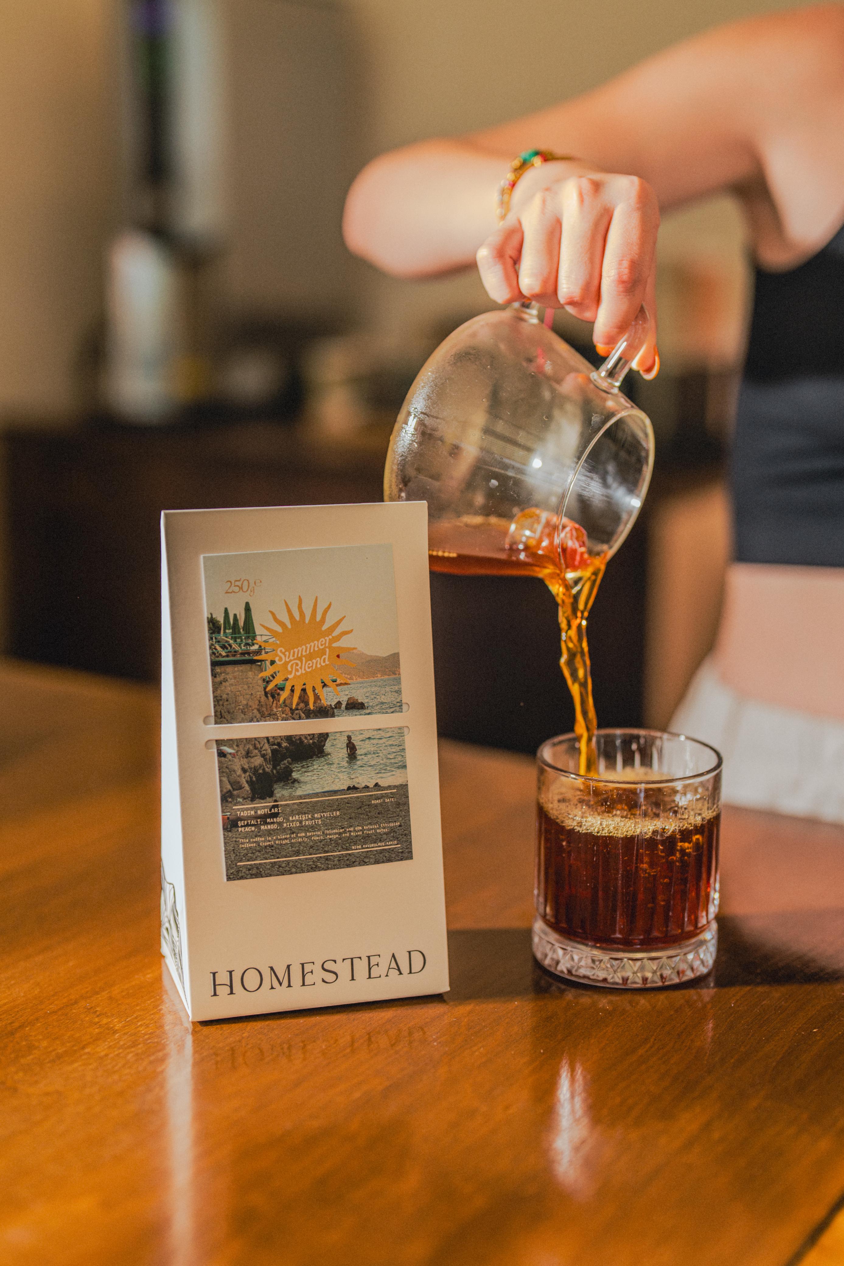
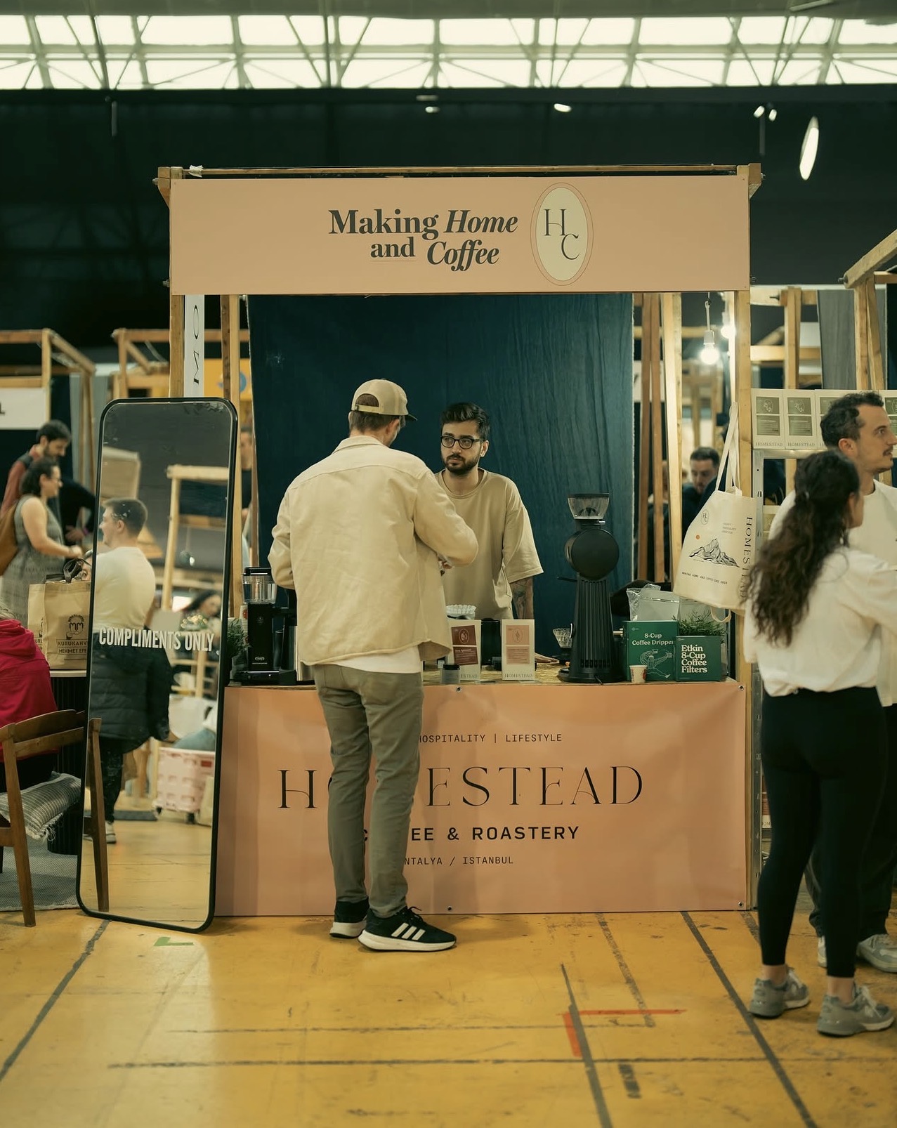
A brand with no visual content is invisible. I directed all photo and video production for Homestead — every product shot, every space image, every piece of content that built an audience of 8,000+ from nothing. No paid ads, no boosted posts.
Shot entirely on location, never in a controlled studio — because Homestead's identity is inseparable from its physical spaces, and that had to show in every image. Natural light, imperfect detail, real moments: latte art drips, hands in frame, morning shadows.
I built a seasonal content cadence around the rhythm of the café — seasonal drops, behind-the-scenes roastery content, quiet morning shots, product launches. Every post fit a role: some grew reach, some drove traffic, some just kept the community warm.
The result: 8K+ organic followers across platforms, 200+ photo and video assets directed, $0 in paid promotion.
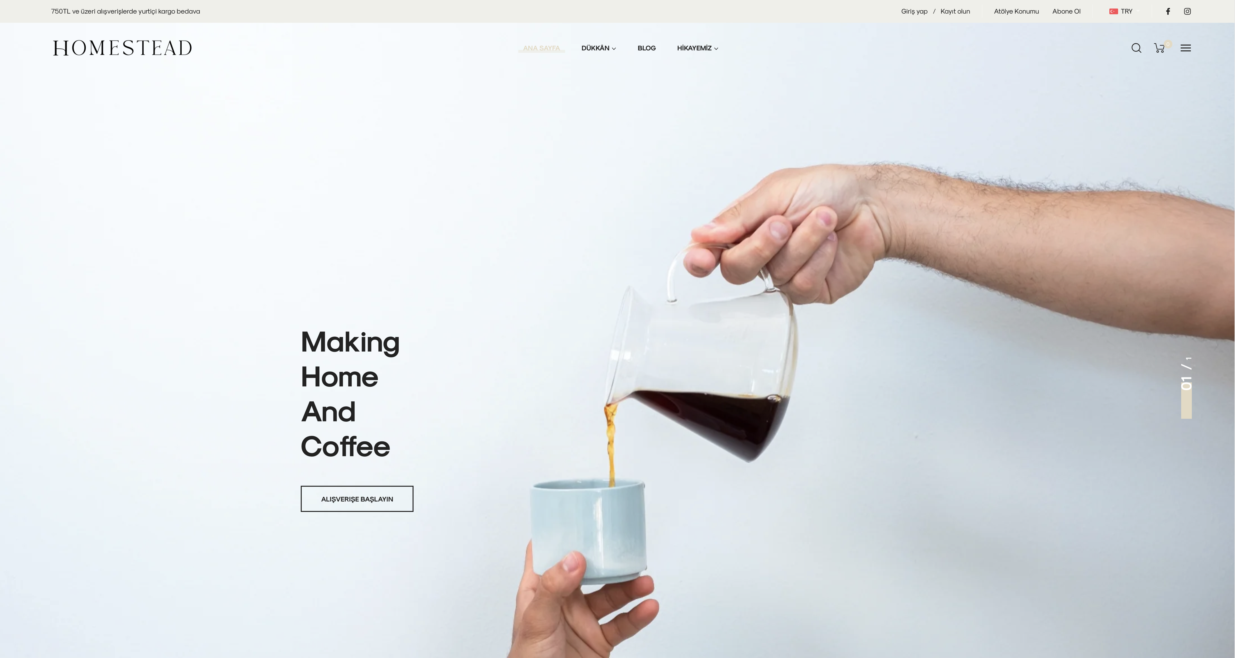
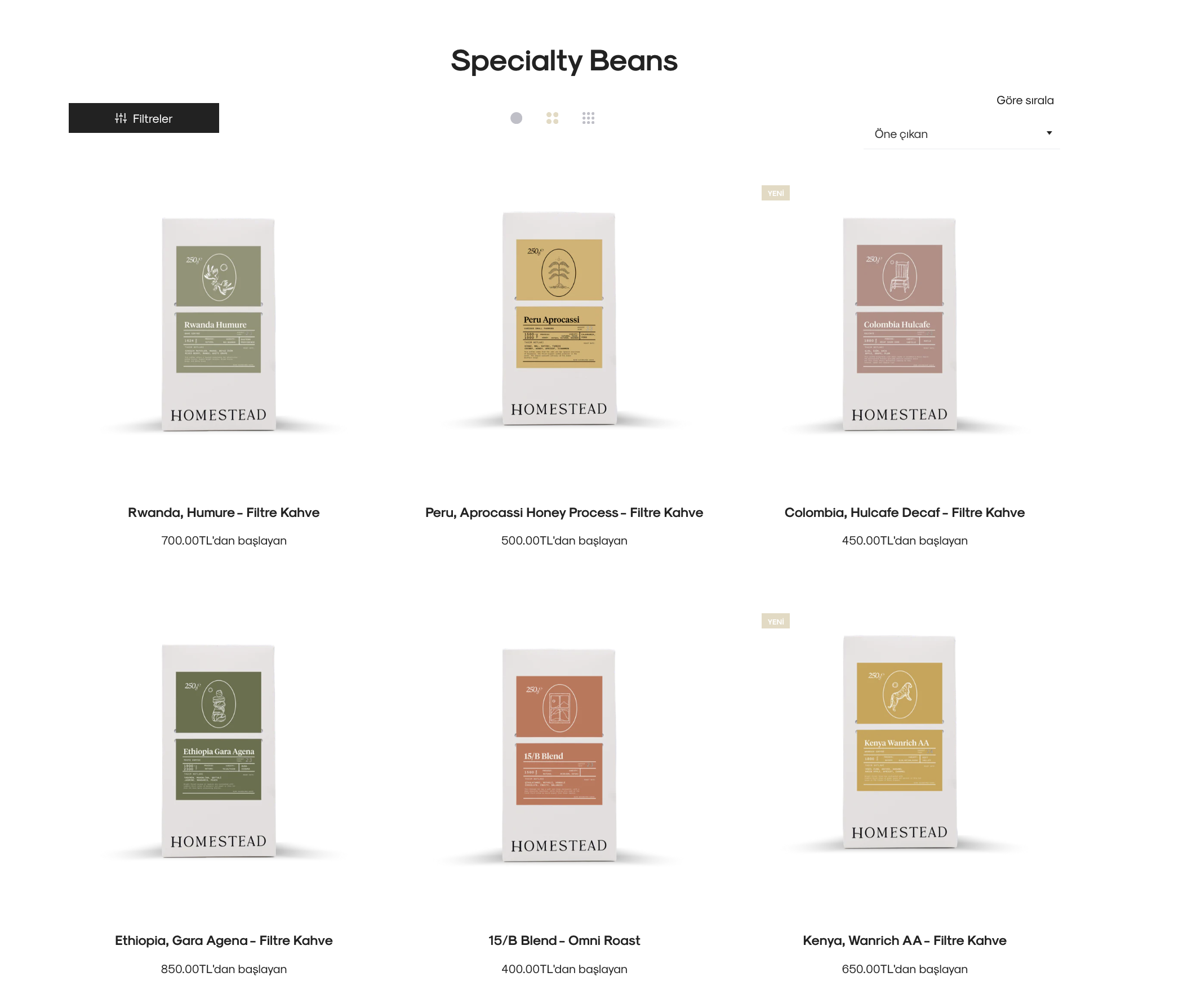
04 · Digital & Web
I designed, wrote, and built homestead.coffee from scratch — no templates, no shortcuts. The site needed to do two things at once: tell the brand story compellingly enough that a first-time visitor understood what made Homestead different, and convert that interest into action.
Every page was treated as a design surface. Typography at scale, deliberate whitespace, and a color palette pulled directly from the identity system. The site loads fast, reads well on mobile, and feels like it belongs to the brand — not the framework it was built on.
Outcome
What started as one location became a brand with three cafés, a roastery, a wholesale program, and a community of over 8,000 followers who felt genuinely connected to what we were building.
The identity held across every new surface it touched — from a cup sleeve to a website to a 2,000 sq ft café — because it was designed to. That's what a real brand system does.